As a company scales up organically to serve more than 300 million customers through multiple products, there is a need to provide a consistent experience.
How do you craft a uniform user interaction across 10 products displayed through devices ranging from mobiles to point-of-sale machines?
The approach was inspired by an analogy of life and atomic design.
The new design system was implemented by testing one product and then applied to the other products.
To comply with a non-disclosure agreement, I have omitted all the confidential information from this project. The details mentioned in this post are my own and do not reflect the views of any company.
Problem Statement
How can a product suite provide consistent experience to end users and enable efficiency to its developers?
Background and my role in the project
Empowering more than 35,000 stores of 400+ brands globally, the product suite that I was working on had an inconsistent experience across touch points. Thus, the end users were not confident while using the products and this in turn decreased their efficiency. Consequently, they ended up calling the client service team to implement their tasks. On the other hand, the development team could not keep up with the release deadlines because of redundant code creation.
I was part of a team that created a design system over a period of one year, in parallel to my responsibilities related to the product suite.
Approach
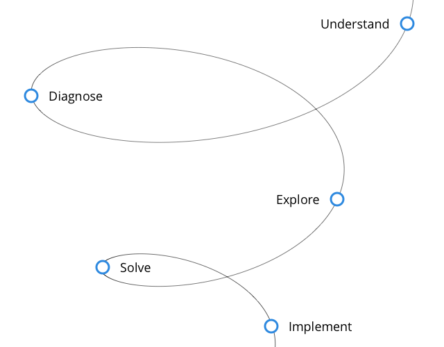
Method
Understand the depth and breadth of the problem: Who are the users affected by the problem? Are all the users facing the same problem? When do they encounter this problem? Do they confront it more than once?
Diagnose the core reason that led to the problem: Why do users face this problem? What are the history logs needed to trace back to the core reason?
Exploring plans to solve the problem: Given the scale of change required, how can the problem be solved without drastically impacting the current functioning?
Solve the problem: Prepare the deliverables and, in parallel, validate them with the stakeholders.
Implement the solution: Convince multiple stakeholders regarding the importance of solving the problem immediately, present the solution, suggest an implementation method, and check the end result.
Understand the depth and breadth of the problem
Power users of the product suite, use more than one product to complete their tasks and the design interaction vary from one product to the other.
Other users who use only one product encounter new interaction with every update.
Every component had multiple variations in different pages which led to inconsistent interactions and multiple layouts.
To make it worse, the experience differed across devices for the same product.
Diagnose the core reason that led to the problem
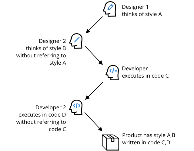
Every product was coded in a different front-end language.
Within a product, every developer had his/her own way of implementation with minimal knowledge transfer and unclear code documentation.
There was no code repository that contained all the implemented elements. This led to redundant coding, inconsistency, and delayed development time.
Designers never checked if a similar problem had been solved earlier.
The employee attrition rate in the company was high. Both designers and developers were allocated to a project on an ad-hoc basis.
Exploring solutions the problem
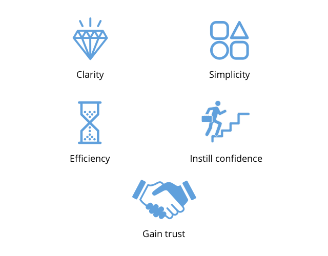
Design values
It was clear that we had to implement a central design and code repository, a framework to create consistent products.
Thus, we (the design team) collaborated with the product and core development team to finalize the most important values that the products should portray.
We used card sorting to come up with the following values (Sorted by priority)
Clarity: Make it transparent; Communicate well; Keep it structured; Tell a story; Make it obvious
Simplicity: Be concise; Disclose progressively
Efficiency: Solve for the majority; Optimize for power users; Preserve the context; provide the right defaults but allow customization
Instill confidence: Keep it consistent; Make it seem familiar; Recommend when needed; Let the user feel in control
Gain trust: Do not have bad surprises; Make it look good; Add a personal touch; Design for delight; Friendly services
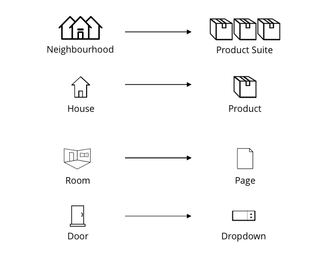
Design analogy
Overwhelmed with the idea of solving this problem, we thought of approaching it with an analogy of life using the atomic design methodology by brad frost
We live in a neighbourhood, consider that as a product suite
Within the neighbourhood, we live in a house. Consider that as a product
Within the house, we have rooms. Consider them as different pages in a product.
Within a room, we have different objects like a table, chair. Consider them to be elements in a page.
Some of the houses in the neighbourhood will have similar floor plans. Consider this to be the similarity of the page layout within the products of a suite.
However, the objects in the rooms of two houses, for example the living room, will be unique to the taste of the owner. Similarly, the elements in a page will depend on the goals of the product.
User Experience analogy
Imagine your daily routines such as getting ready to go to the office, we follow the same sequence of tasks irrespective of where we stay.
I wake up, freshen up, exercise, prepare breakfast and then leave. So I use the bedroom, bathroom, living room, and the kitchen to achieve this goal.
Similarly we tried to achieve a similar consistent user flow in all the product to achieve a goal such as to create a new entity in a product.
This consistency will help in building confidence among users because they can expect what comes next irrespective of the product.
Solving the problem
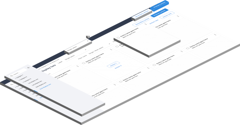
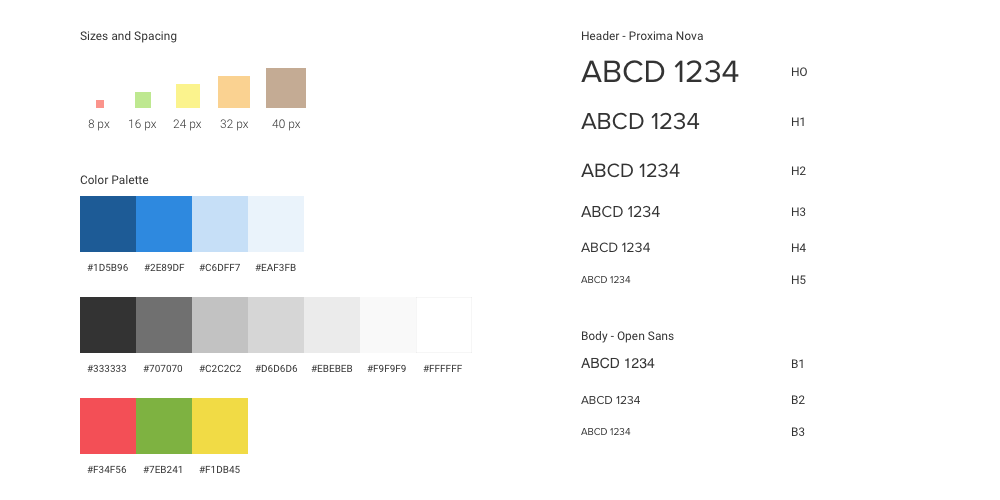
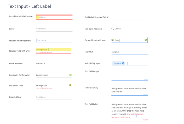
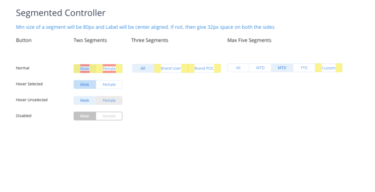
We took a bottom up approach where we finalized the main global attributes like size and spacing, color palette, and typography first adhering to the design values.
Then we created every state of individual elements and its variations.
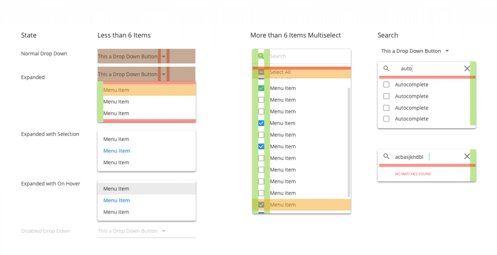
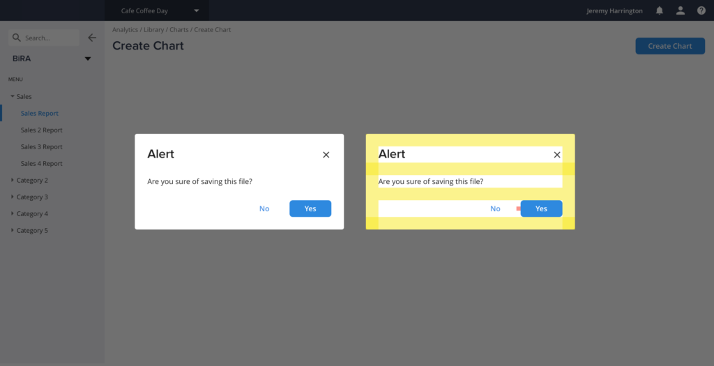
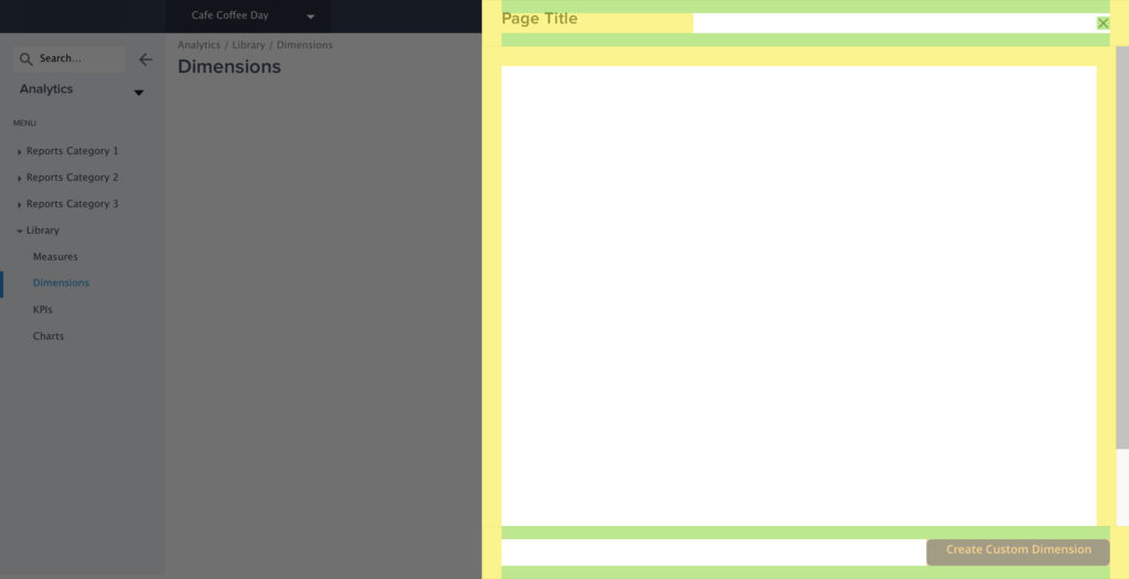
For example – a drop down menu can have a default state, a hover state, an expanded state, an expanded state with selection, an expanded state with a hover on an option. – the variation of a drop down menu include single select, multi- select, multi- select with search.
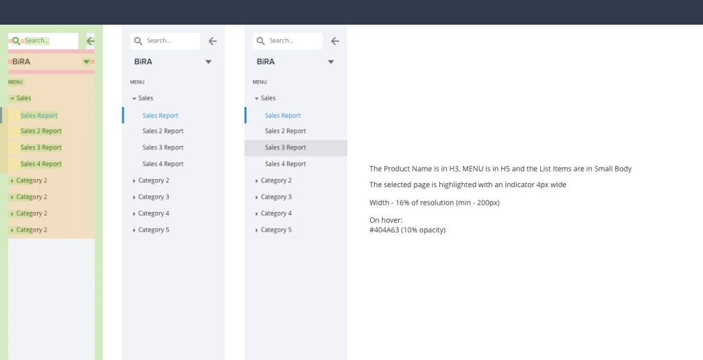
After creating individual elements, we combined these elements to create components like the sidebar, which can be compared to a layout in the design analogy.
Result
These specifications were given to developers who implemented them from scratch and created a repository. These elements were then used to create any page.
Impact
We could successfully decrease the development time by 20% measured through the development sprint time. Moreover, users loved the new experience which was measured through a net promoter score and by the drastic decrease (43%) in the number of calls received by the service team. Thus, users started to embrace the self-service model of the product suite.